Toca TV, TV you can touch
Toca Boca’s NY based team focused on developing a brand new video on demand service called Toca TV, specially designed for kids aged 5 to 9 years old. Toca TV includes a fun video player, UGC tools, along with curated and original content. The app was launched in Canada first.
(Update: in 2017 Toca Boca closed the NY office and ended the production of Toca TV )
As design director, I worked with the executive producer, technology director, and content director, and together we made a playful, immersive experience for our target users. These kids are youtube users with aspirations to create their videos. As part of the core team, I led the concept definition, ideation, competitive research, UX, user testing, visual design, branding, animations, sound effects, prototypes, worked in conjunction with the engineering team through to the final product to achieve high standards of usability and quality.
Year: 2015 - 2016
Challenges
The biggest challenge was to create a product for an established gaming company, used to launch successful games for kids of all ages. Toca Boca wanted to expand their business creating their first non-game product. Toca Boca decided to open a new office in New York to allow the necessary space away from the Stockholm office to create Toca TV. Additionally, we knew that this product relies heavily on the quality of the content, so we built an additional team in New York dedicated to creating original content for the platform.
Product Challenges
Design a product worth for a monthly subscription
Differentiate ourselves from our competitors like You Tube Kids by having hand-picked license videos
Exclusive Toca Boca content, both animation and live action.
A recording video tool to inspire kids to create their own stories
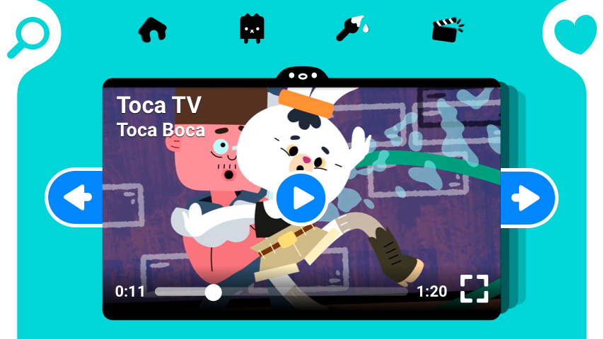
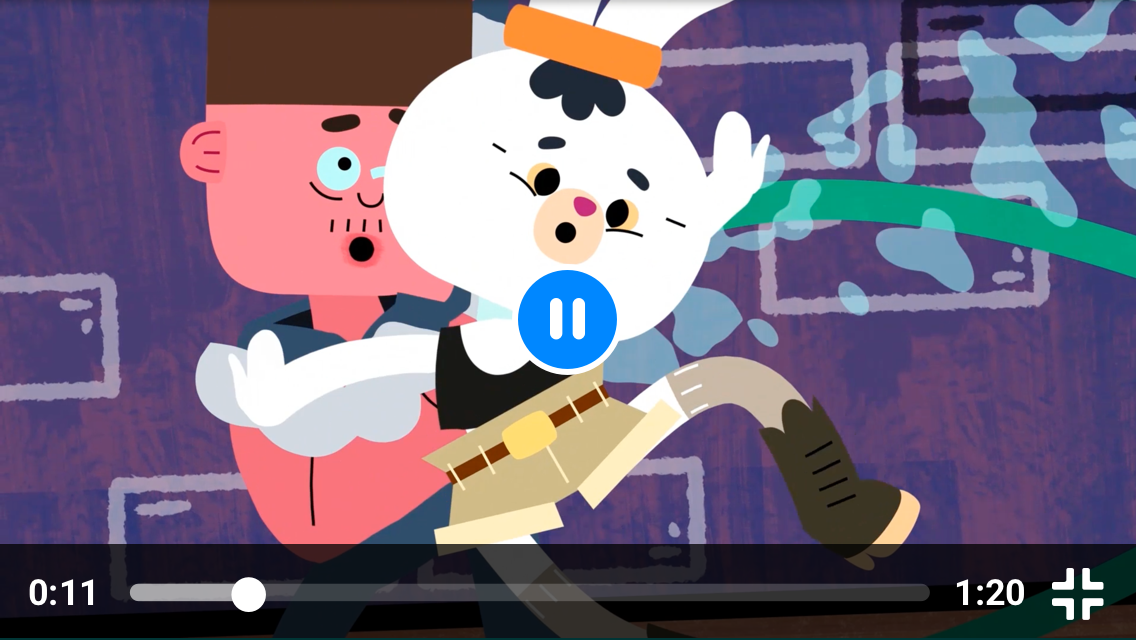
A playful player experience where the video itself is a character
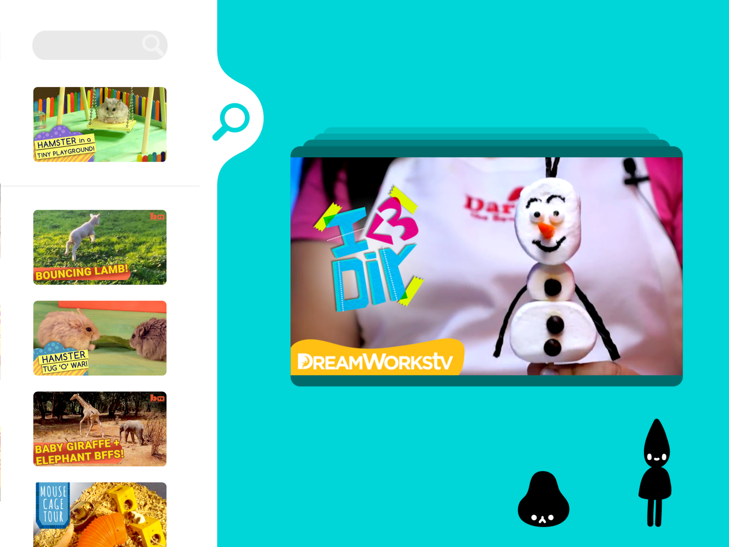
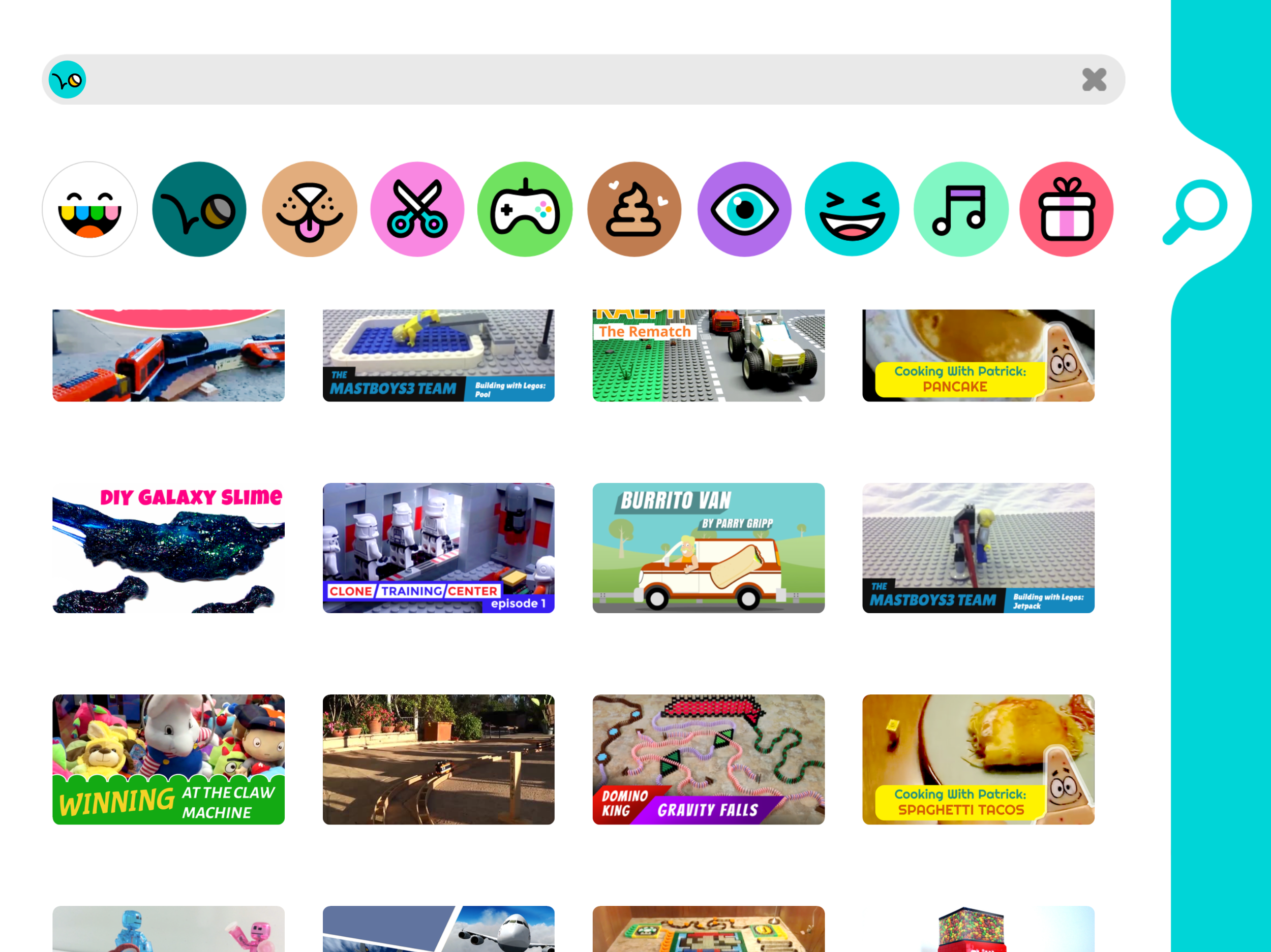
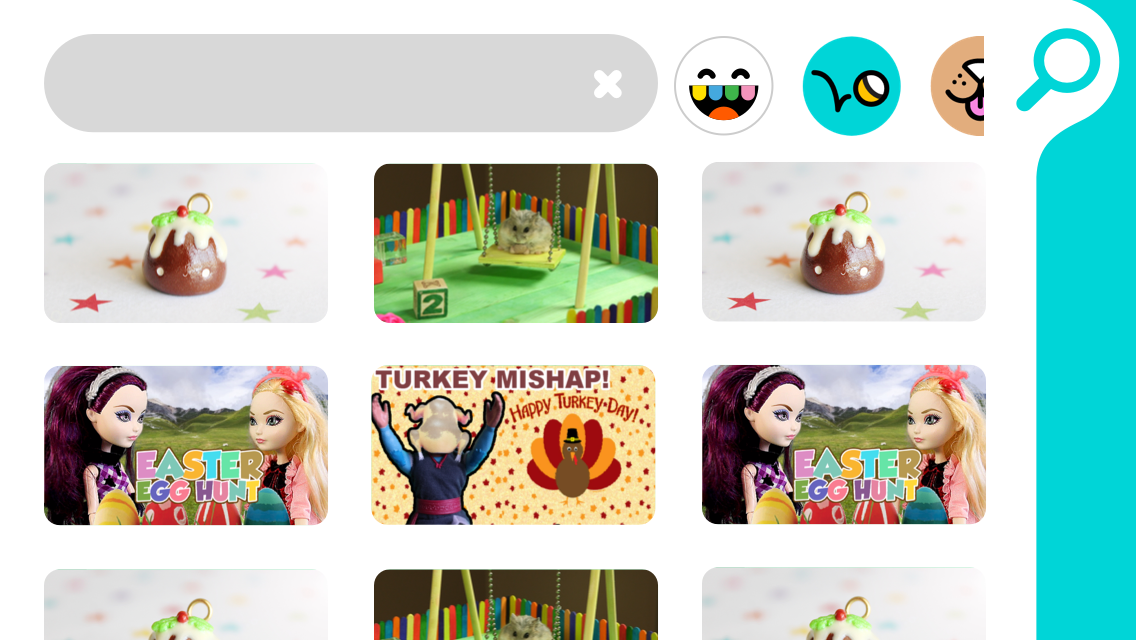
An image-based video search feature
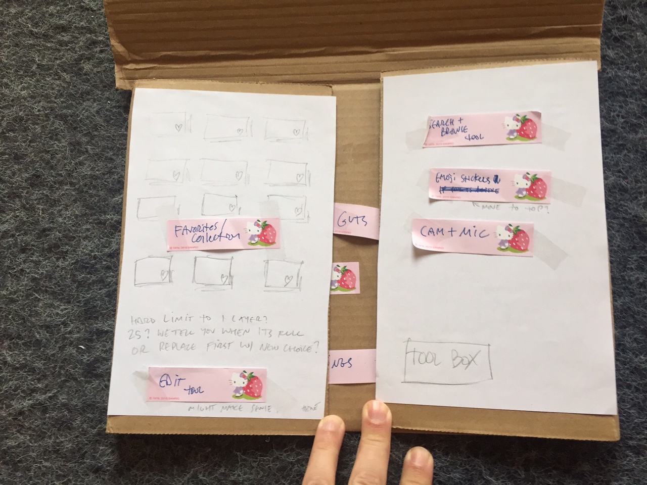
Ability to collect all your favorite videos.


THE BEGINNING
We started by developing an MVP in two months that we tested with 250 families, fans of Toca Boca all over the world. We created a closed Facebook Group to received feedback from the families and to communicate new updates or new features. This unity MVP built on the idea that we were going to create a playful player based on Toca Boca's philosophy, the power of play. It consisted of an infinite stack of videos that the kids could rate if they like them or not. But we imagine it as an object.
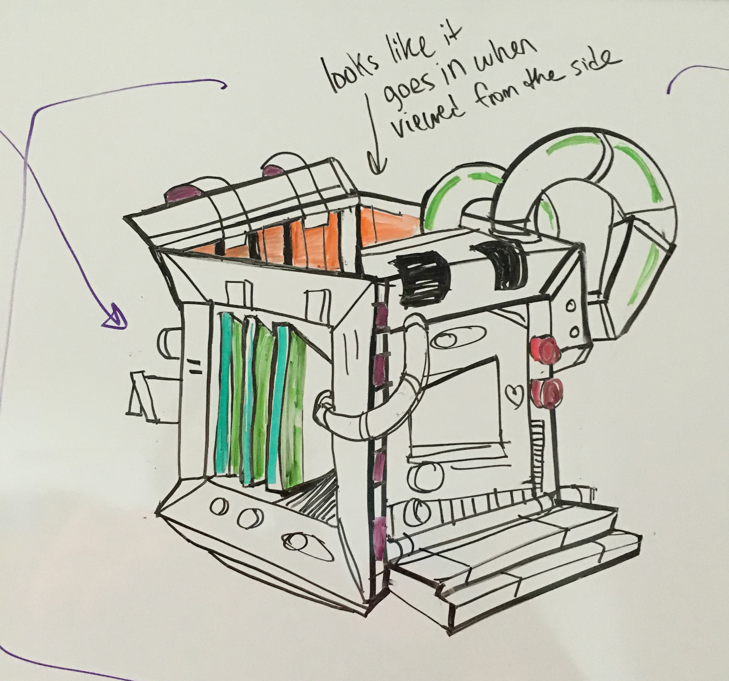
THE MACHINE
After some brainstorm sessions with the team. We agree that we needed a metaphor that can hold this idea of playfulness and functionality. We start drawing in boards into we came to the idea of building a machine. An imaginary machine that could be the player of the future. The process started by working with an illustrator to get to the shape of the machine that could live in the Toca Boca world. Next step was transforming this idea into a 3D object taking advantage of UNITY.
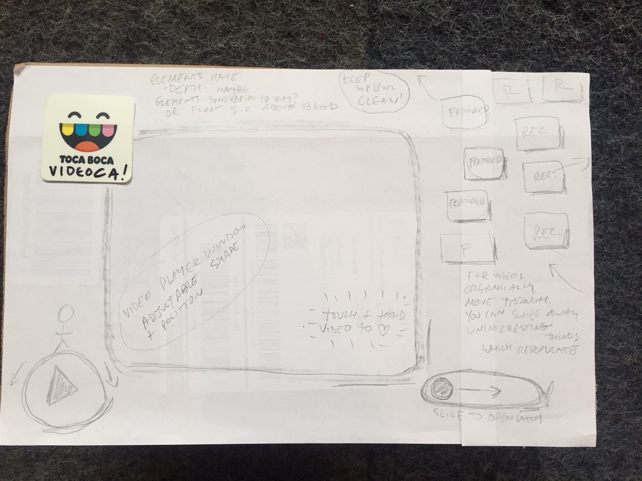
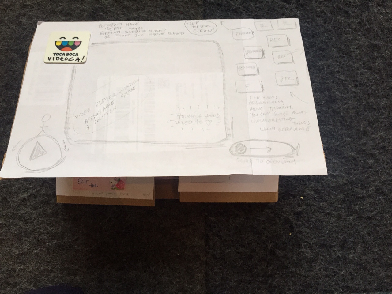
In the planning phase with the product manager, we decided to leave the machine for a future release and launch the MVP only with the player screen, the browse screen which in this case will be a grid of predetermined playlists by categories and a collection screen. We wanted to test reactions of the kids to the stack, the content itself and the interaction with this main page.


how did the machine work
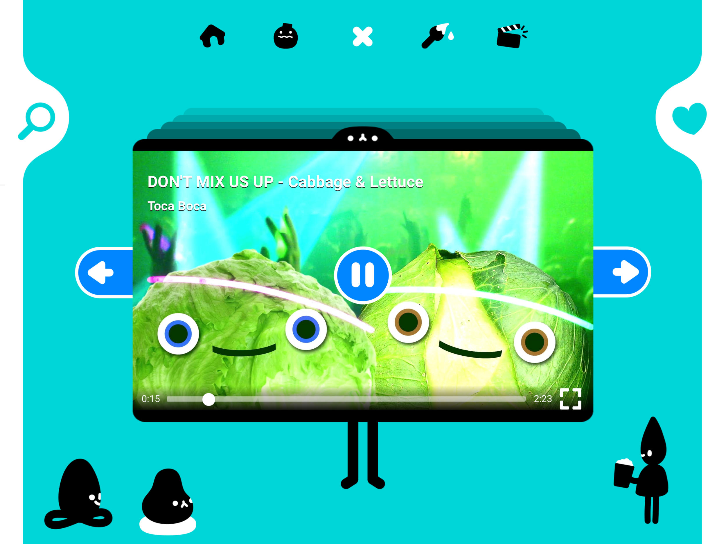
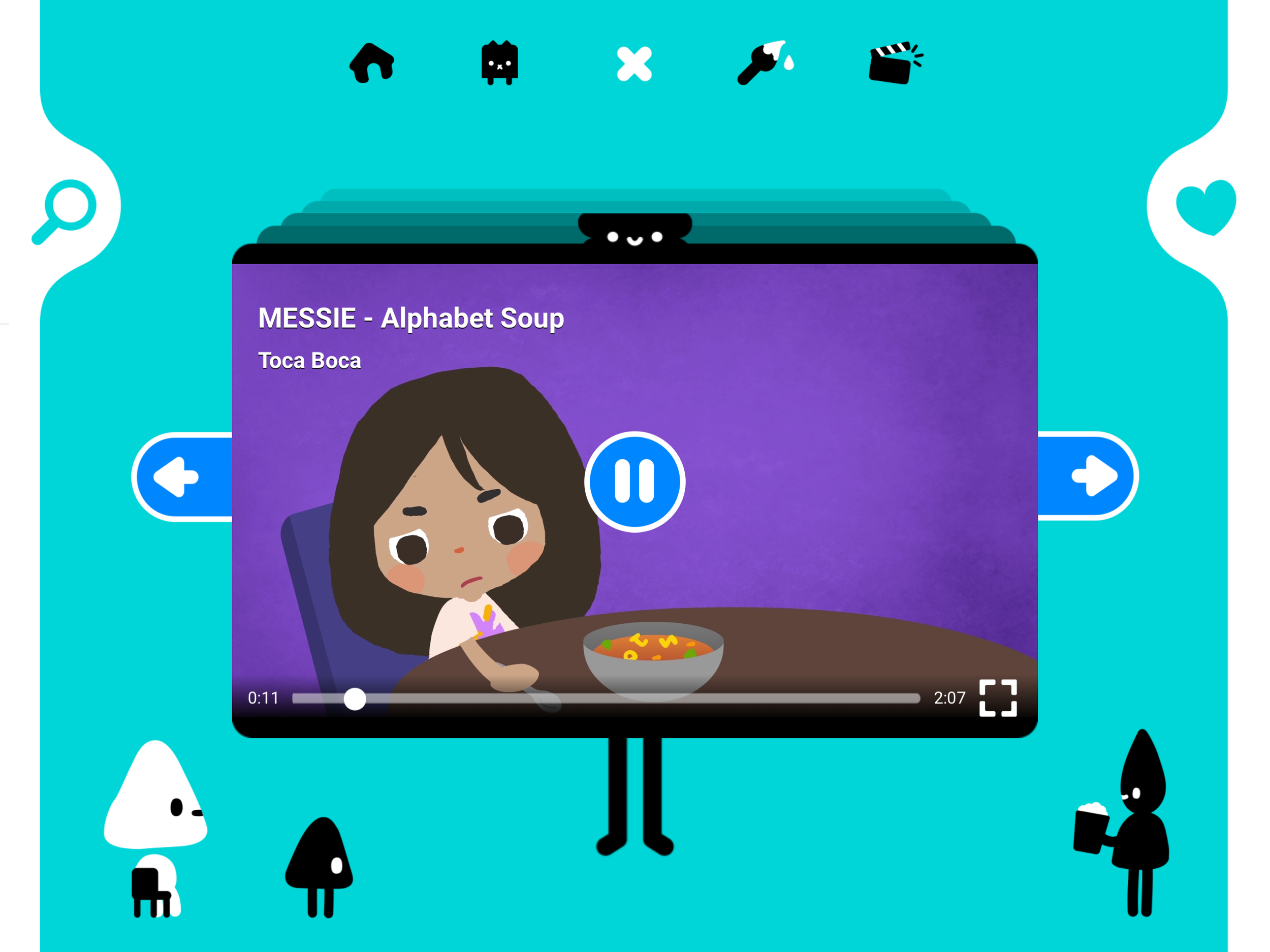
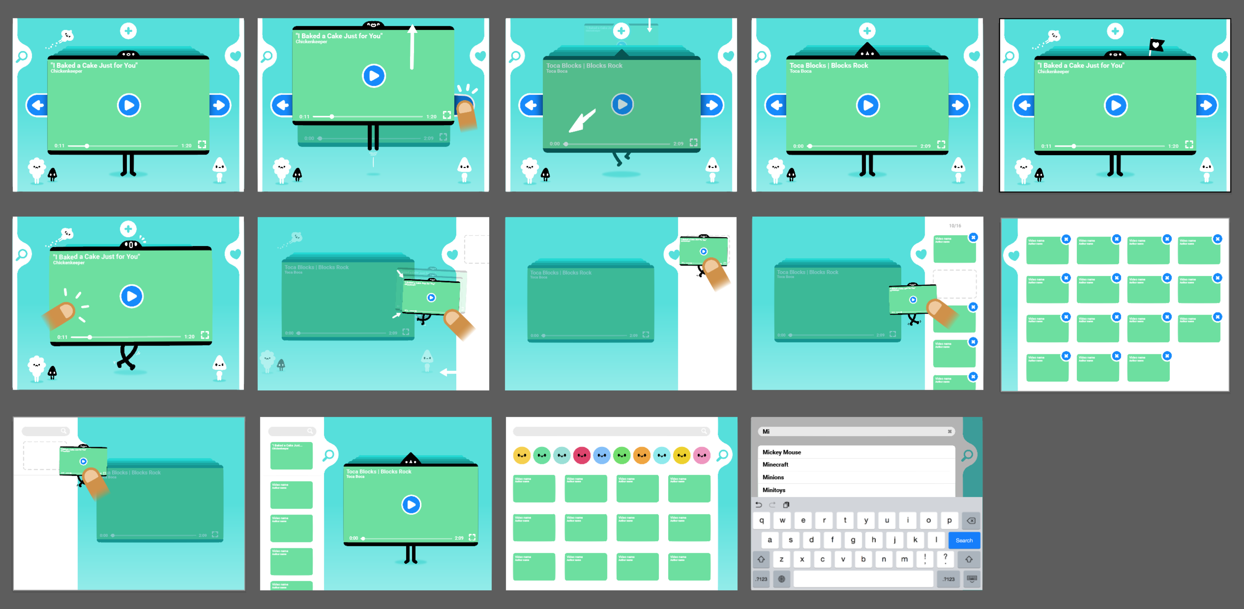
The first screen that is going to be the main stack. Curated with new content, original content, most viewed and liked. The character on the right side which is happy represents that the kid liked the video. By tapping this character, the video would be saved in the collection. On the other hand, the character on the left represents the opposite feeling. This interaction was going to give us data to build a smart stack with recommendations based on each kid's taste. In both situations tapping into a character will change the video.
After a few tests with kids at the office, we realized that they were using the characters as arrows just to pass to the next video or the previous one, so we decided to move the pipe to the bottom, get rid of the characters and replace them with arrows. The pipe is the connection between the player and the collection screen and it is represented in the 3D machine.
TAKEAWAYS OF THIS PROTOTYPE
The machine was getting in the way. We were losing focus on what was important, building a video platform where the king is the content.
Function versus design. In this case, the functionality was given by the drawings and illustrations.
3D wasn't the best choice to work with video.
The shift

After two months we decided to start again building a Native iOS app. Starting this process was faster, and all the initials thoughts of layers of interactions came back again. We were inspired by other Toca Boca app: Toca Kitchen 2, where some panels appear from the sides and enrich the experience without leaving the main scenario.
DEFINING THE INTERACTION
USER FLOWS AND prototypes
One of the most difficult parts to design was the registration process. Dealing with COPPA (Children's Online Privacy Protection Rule) and Apple, and at the same time making it an app directed to kids, we had to find a sweet spot to not compromise the user experience. Many versions were tested with the stakeholders before even show it to the users. Some weeks after launching, we decided with the marketing team, to change the strategy of registration, by leaving the app open for 1 week, before entering into the sign up process, so they can experience the app without any restrictions. The user flow and prototypes were used to send to the engineer team that was working remotely. In this case, mini interactions were extremely important to the flow of the experience.

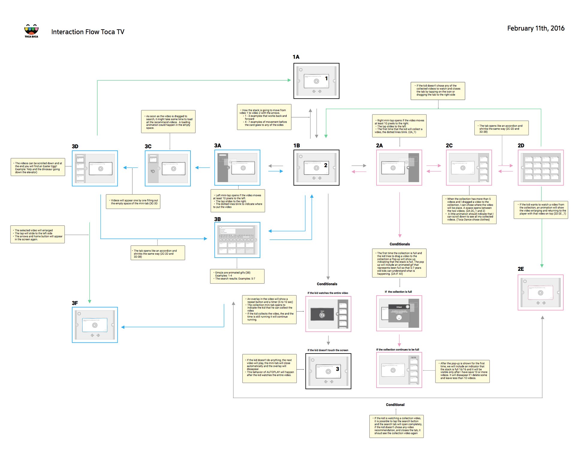


Key decisions
Video title and creator lines were distracting and taking away from the playfulness of the design. With the text, the video appears as no longer an object, a whole, or appropriate to the visual metaphors we were using. We decided to take away the text and create playfully designed video thumbnails. These thumbnails needed to work for phones too, so it was challenging to create guidelines for designers that fulfill all the requirements to be a good promotional image that tells the story of the video.
The decision of eliminating any text, except the parts where the parents could be involved (like the registration process, login or any technical pop-up that needs help), make us realized the importance of the micro animations and interactions. Feedback should be given with sound or animation.
Defining a flat color palette that harmonized the experience without taking attention to the videos.


Going Mobile
As soon as we finished the iPad version, we started with the phones and android versions of the app. The challenge here was to translate the experience as smooth as possible. We had to rethink the interface and the hierarchy of all the elements there. It was important to maintain the core experience, and we doubted if we should maintain the playful experience with the characters of the background. We organized better the UI and separated it from the template or background design of the app. The challenge of defining the size of the thumbnails was important because the image needed to be readable in a small size.


retrospective
We are just starting. Having launched the app in Canada gave us the opportunity to get real data that would help us understand viewing patterns to build a better search engine recommendation, make iterations on the design in general. Registration and creation of the profile are things that can be simplified for the US launch. The branding of the product is extremely important. Defining where does that logo should stand with the Toca Boca logo and apps. I lead the branding RFP and work with some branding consultants to continue developing a cohesive and beautiful logo, easy to remember and catchy for the kids.
What I learned
As a product designer is extremely important to understand the business objectives that we are trying to achieve and create my own design strategy
Building a product is very different than building a game, therefore it is important to make that difference clear to the team and the people that were doing this for the first time
Trying to define our product as the same time we are developing a brand is hard. Until the product is not defined you can't write the right brief for someone to understand your product.
Educate your team at the same time you are creating processes and understanding the pace of learning curve.
The best way to explain an idea is to do it. Draw it, design it, prototype it and test it.
Team
Design Director: Valentina Camacho
Product Manager: Abby Adams
Executive Producer: J Milligan
UX and prototypes: Valentina Camacho, Hector Ardila and Paola Rangel
Animations: Cassandra Bergen, Heidi Sullivan, Nadya del Valle, Deepa Paulus
UX research: Jonathan Abrahams
Sound Design: Merche Blasco
Visual Design: Daniel Abensour
Branding: Red Antler, Viet Cuong, Cristian Vargas
About Toca Boca
Toca Boca, the No. 1 mobile first kids brand in the App Store, is a play studio that makes digital toys for kids. Since its first product launch in 2011, Toca Boca has released 31 apps that have been downloaded in 215 countries worldwide. With more than 120 million total downloads to date, Toca Boca apps focus on stimulating kids’ imaginations so that they can play and have fun in a safe digital environment. With offices in San Francisco, Stockholm and New York, Toca Boca is part of Spin Master.